Ecosystems is a leading company in the value management industry, providing a robust platform that helps B2B organizations make their value clear to their customers. My responsibilities in this project ranged from producing UI designs for the platform to creating customer-specific output reports tailored to meet clients' specific business needs.
Notable clients such as HP, Google, Qualtrics, Verizon, Zuora, GitLab, and Palo Alto Networks have achieved significant success using the Ecosystems platform, experiencing up to a threefold increase in deal size and a 61% spike in win rates.
A storytelling animation video to explain the services the Ecosystems’ software supports its clients with. Their platform, the VMO (Value Management Office), serves multiple leading organizations from various industries, IT, printing, healthcare, etc. Its three core messages are focused on how they help customers win the deals, retain accounts, and grow as an organization by directly collaborating with the customers, and building value drivers together (referred as Lego blocks in this project).
This explainer video was an opportunity to take full ownership from storyboarding to final product. Ecosystems’ software, called the VMO (Value Management Office), supports Fortune 500 IT organizations throughout their customer sales cycle. This video is designed to help enterprise sales reps understand how the VMO works, and how to leverage VMO software to gain the best sales practices and outcomes.
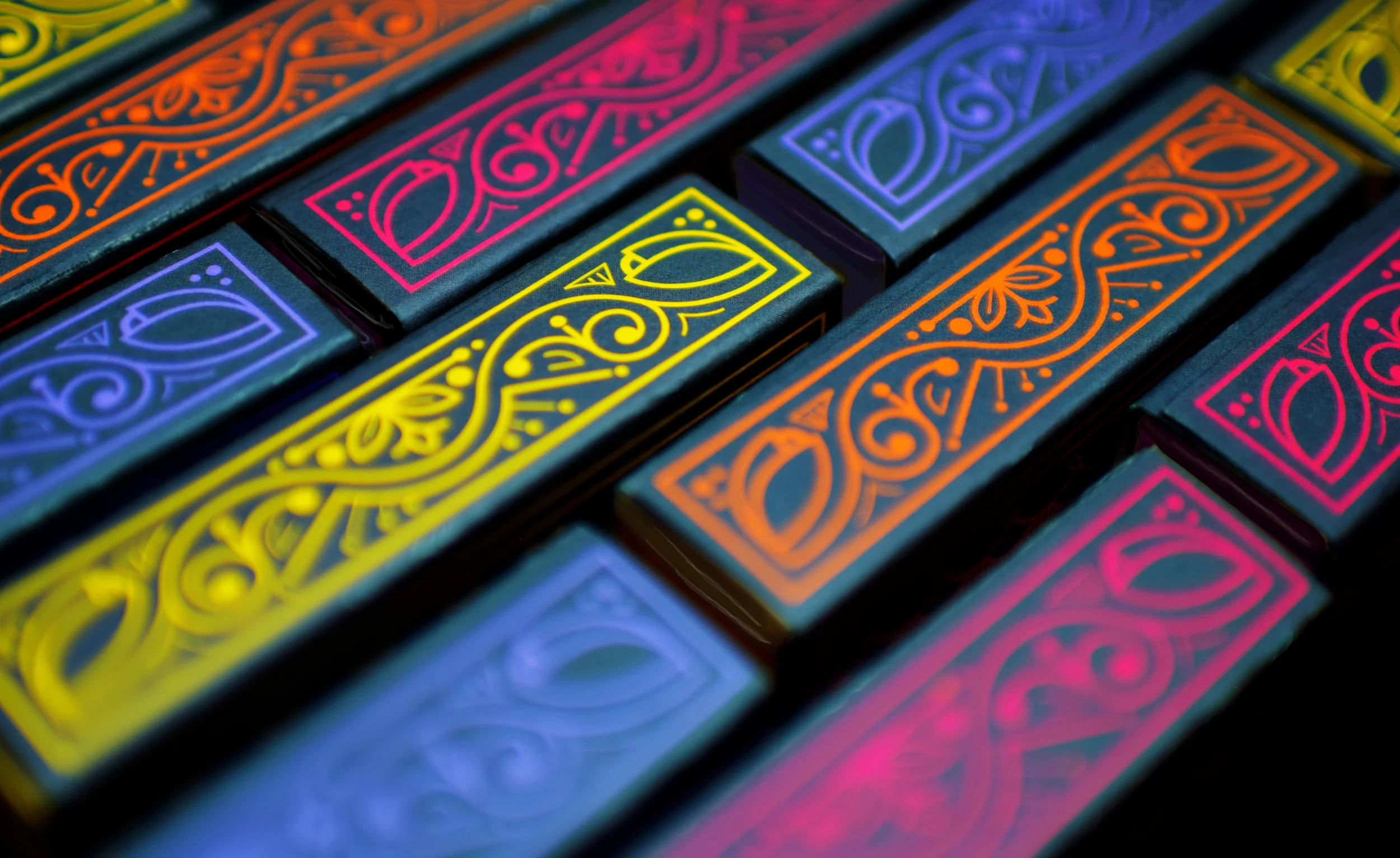
Package design concept for a boutique cookie branding line, Cookie Cabinet.
The design is to make you feel as if you were snatching a cookie from a mysterious and secretive cabinet, which is implied through a sassy but confident voice in the description of each cookie. Each cookie is baked with a unique combination of healthy gourmet ingredients. Bright vivid colors are chosen to be pertinent to the flavor with a semi-black background, adding another level of sophistication to the design.
Personal project with a branding concept for a modern meditation business.
Various collaterals are created to target a wide audience in the city. People with busy lifestyles who struggle with daily stress and seek mental relief—they feel the need to PAUSE and free themselves from tension. The goal was to visually attract these audience by utilizing soothing color schemes and a quiet tone.
Various marketing designs for the Stamp Marketing Department at the University of Maryland College Park: posters, banners, brochures, collateral materials, invitation cards, and images for social media.
A poster design requested by American University inviting students to a "voice" meeting to talk about the current trend of exclusion in job searching and information on career opportunities.
The piece was created while working at Seaberry.
A mobile application for everyone around the world to inspire each other daily with their short and creative messages.
The primary target for this app is young adults who are familiar with common motion on the latest mobile devices. The floating theme of the main menu triggers people's interest in exploring the interactive aspect of modern mobile app design. The key to meditative and quiet atmosphere is the gradual change in background color between blue and green.
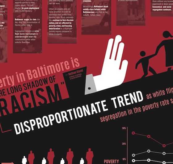
An award-winning infographic design to raise awareness on the severity of impoverished areas in Baltimore. The concept of timeline is transformed into an impoverished person's average lifespan which is 63 years. The poverty starts from being born and never ends until a person faces death - this infograph reveals what occurs during 63 years.
Dark red and black are primary colors to deliver visual shock to the audience with a great amount of contrast. Yet, the tone of design elements are subtle enough to allow comfortable reading.
*This piece was picked for a poster design category by AIGA Blue Ridge Flux, 2015
A collection of icons used on the dashboard page of the DC Department of Health's website. Each icon is related to a different disease or relevant health information provided by the client. The design's goal was to provide a sense of positivity for the audience to ease them into learning about diseases.
The piece was created while working at Seaberry.
Collateral items to promote Service 24/7, one of the Service Departments located at the University of Maryland. Their mission is to connect the people of Prince George's County, MD, in need of support with local organizations that provide human services.
The combination of bright yellow and red creates a sense of alerting to draw people's attention - it's rememberable for a crisis situation people might encounter.
Logo design concept and branding collateral for Barking Mad, a restaurant that serves premium coffee and savory grilled dishes indicated through their tag line. The restaurant desires to serve as a hidden jewel for young music and food lovers in the city. Also, their mission includes creating food from their on-site aeroponic, organic garden where they grow vegetables, herbs and edible flowers.
Responsive website design to showcase works by a fashion designer in New York, Lie Sang Bong. Lie's fashion elements come from his appreciation of creatures in nature: flowers, butterflies, leaves, etc. Bright and stunning colors are prominent while pursuing the simplicity in his work.
Campaign proposal designs to raise awareness for the fostering programs at local animal shelters through magazine ads. Various types of audiences are targeted with careful choice of three magazine brands including Good Housekeeping, AARP, and Rolling Stone. Website design is also created, which provides more details about the campaign.